Search is becoming more recognized as an important aspect of increasing conversions on e-commerce sites and businesses realize that they will have to deliver fast and accurate results. One aspect some stores don’t give enough thought to is how the results appear to visitors using their e-commerce search.
A detailed and well-designed search result listing page goes a long way in increasing conversions for e-commerce stores. This practice of having a descriptive product listing is crucial now when the majority of traffic and revenue for most e-commerce businesses comes from mobile. Mobile users often experience connectivity problems so it becomes vital to ensure that they do not have to sit through long loading times to get product details.
It is hard to pinpoint what would be considered important information in different industries but here are some major features an e-commerce business should include.
1. Concise Product Name
While it may work for some niche brands to use model numbers in the part of the name, typically stores should use names that contain relevant information about the product. The name should be representative of the product in question. If you are a brand then you might also consider using model names.
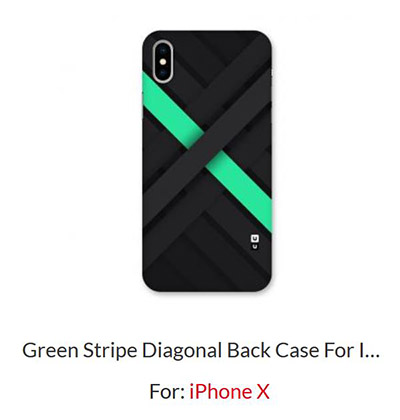
CoversCart mentions the design name and the phone model for which they are intended in the search results page.
2. Prices and Discounts
It is usually the most important attribute that should be shown in the search results listing. It’s also recommended to show if the price has changed because of any discounts. Having a small sticker which specifies the discount percentage helps catch the eye of shoppers. Same can also be said in the case of free-shipping This removes unnecessary friction between the customers and your store.
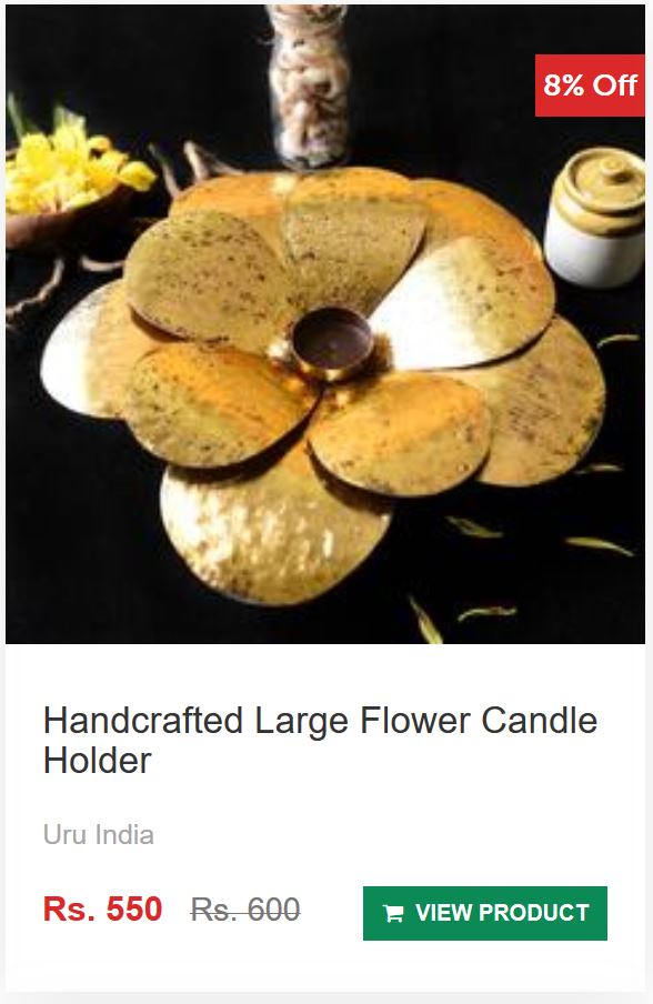
Qtrove not only displays the discounted price but also the original price along with a badge with the discount percentage.
3. Detailed Pictures
For some industries like fashion, accessories, and home decor, shoppers make up their mind based on how a product looks and not the price. Detailed images should be able to communicate to shoppers the form and function of the product. Stores should also use alternate images on a carousel to show on hover or click to show different angles of the product. Some stores are going a step further and showing GIFs or videos instead to show the product in action. This increases user engagement with your e-commerce platform and they might become interested in making a purchase.
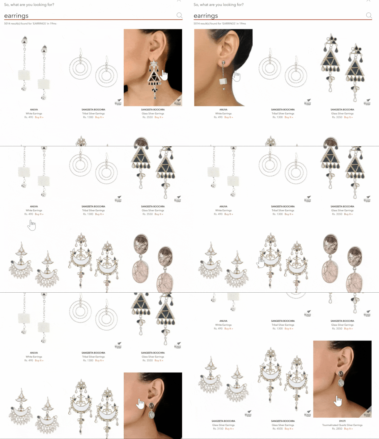
Hovering over the search results on Jaypore will show alternate images of the products. Some focus on the design while others show the jewellery being worn.

4. Other Variants
Show alternate variants with the product itself instead of the same product appearing multiple times in the search listing. This way the search results page is less cluttered and shoppers can find what they are looking for much simpler. These can be alternate colours, sizes or any other options offered by your e-commerce website. A customizable search solution like SearchTap.io can help your store get the perfect look for your store.
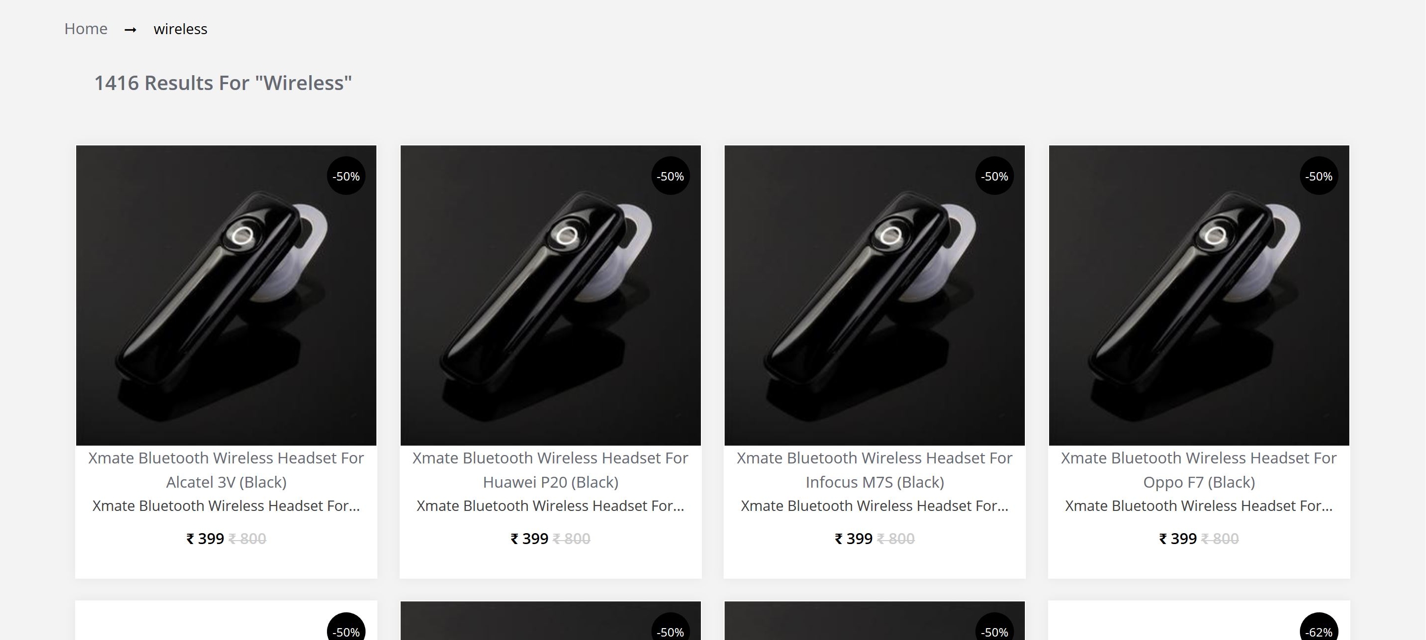
Showing the same product with different variants can easily clutter up the page and result in a poor searching experience.
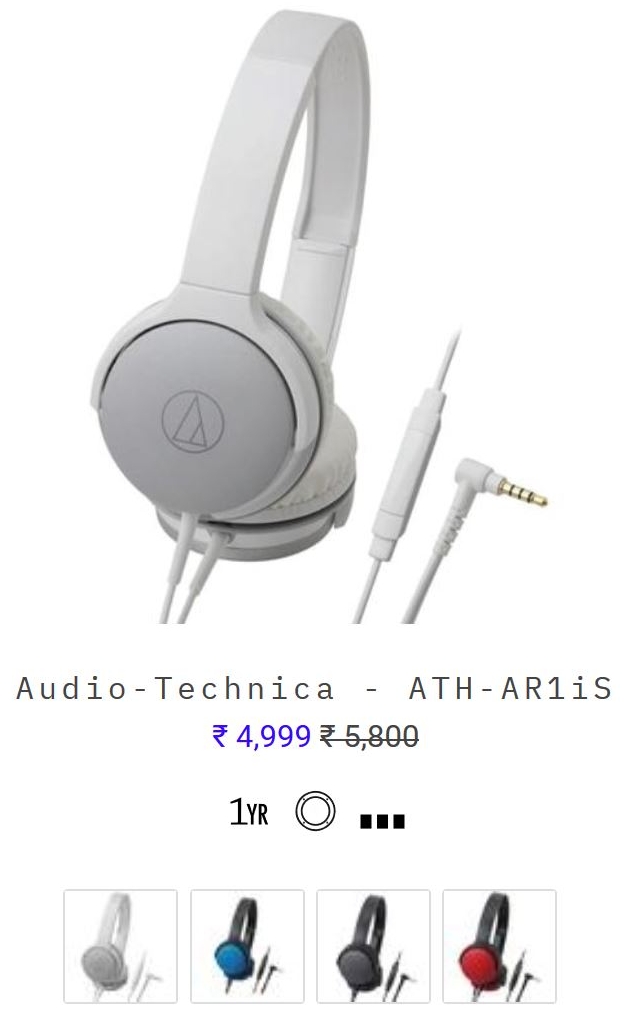 Headphone Zone showing the alternatives of a product beneath the original listing. Search users can hover
over the variants to see how the product will look.
5. Key Features
For some products, especially in the electronics and furniture industry, people will compare features of similar products before completing a purchase. This is also starting to become a trend with fashion brands as well with labels like low-rise or mid-rise appearing on jeans and trousers to name a few. Highlighting some core features of the products in the search results pages saves the customers from clicking through to irrelevant products and improves their overall shopping experience.

Headphone Zone utilizes the space below the search listing with abbreviations and symbols which a customer can know more about by hovering over.
6. Call-to-action
Including CTA (Call-to-action) buttons in your search results listing is a great way to capture purchase intent early. “Buy Now”, “Add to Cart”, and “Add to Wishlist” are some of the most common CTAs used by e-commerce stores. You can also have a “Contact Us” button in case your offering requires significant customizations. One thing to make sure with these buttons are not obscuring any part of the image or any other element of the site like “Back to Top” buttons.
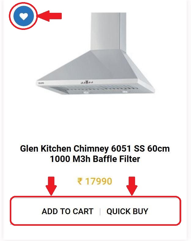
Glen Appliances website serves as an excellent example of utilizing CTAs that can help ease a customer’s purchase journey.
7. Customer Rating
Customer rating provides valuable social proof to your platform. Many customers check how the product was received by others having a ready reckoner in the form of customer rating can help influence their decision. This is also a fantastic SEO practice and comes highly recommended by many experts. If your site is not getting many reviews you can consider removing them till a later date.
Conclusion
The goal of creating a superb search listing page is not to overwhelm visitors with information but letting them access the knowledge that will help them the most in making a purchase. When relevant information is presented in an orderly and careful manner, shoppers can make informed decisions without clicking on each and every individual product.
It is generally recommended that you should try and include at least 2-3 of the above options to shorten the purchasing process. This will lead to higher chances of your visitors converting on the search page itself.
SearchTap.io has helped many online businesses and brands significantly increase their conversions and revenue by improving their search experience. Find out your e-commerce search can be improved with a one-to-one demo with SearchTap.io.


Hi there! Want to ask about something? Leave a message.