As the retail space becomes more and more competitive, businesses are looking for ways to optimize conversions on their site without spending too much time and resources away from core projects. More and more conversion experts have narrowed down on improving site search as the next step in increasing profitability.
Site search is one of the easiest ways a store can look at when they try to increase conversions and revenue. It has the double benefit of not only improving site navigation leading to better user experience but plays a crucial role in streamlining a shopper’s purchase journey.
Yet, we’ve come across many stores that have a poor search experience. The reasons have ranged from poorly optimized search, confusing UX/UI, or lacking conversion tools on the search results page. With all this in mind, we’ve come up with a basic guide for upcoming e-commerce brands and stores to get started.
Where to place the search box
One of the first decisions a store will have to make is where they will place their search box. To answer this question let’s first understand where do people expect to find your e-commerce search box on desktop or mobile. This also impacts the placement of filters for the search results page.
A common rule that is referred to is the F-shaped pattern of reading. This highlights the most viewed portions of the screen when a visitor is looking for navigation tools to help them explore the site.
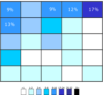
For mobile, you can take this a step further by looking at the screen resolutions and viewports. Viewports are the user's visible area of a web page and are generally much smaller than you might expect, even for high-resolution phones.
Research shows that the most popular viewports are 414 x 896 and 375 x 812 for Apple and 411 x 731 and 360 x 740 for Android phones. Also, look at your analytics to get data relevant to your store. When the search bar or tab appears within these dimensions, it makes mobile shopping experiences exponentially better.
Size of the search field
Stores will also have to look at how much space the search bar needs. What is important here is that a visitor can comfortably enter their query no matter how long it is. The recommended length for the bar is at least 27 characters so it can accommodate multiple words without obscuring search query.
If this space is too cramped, like it can be on the smaller screens of mobile visitors, it will lead to a lot of typos which could result in zero-result pages based on how well your e-commerce search is optimized.

Show results faster
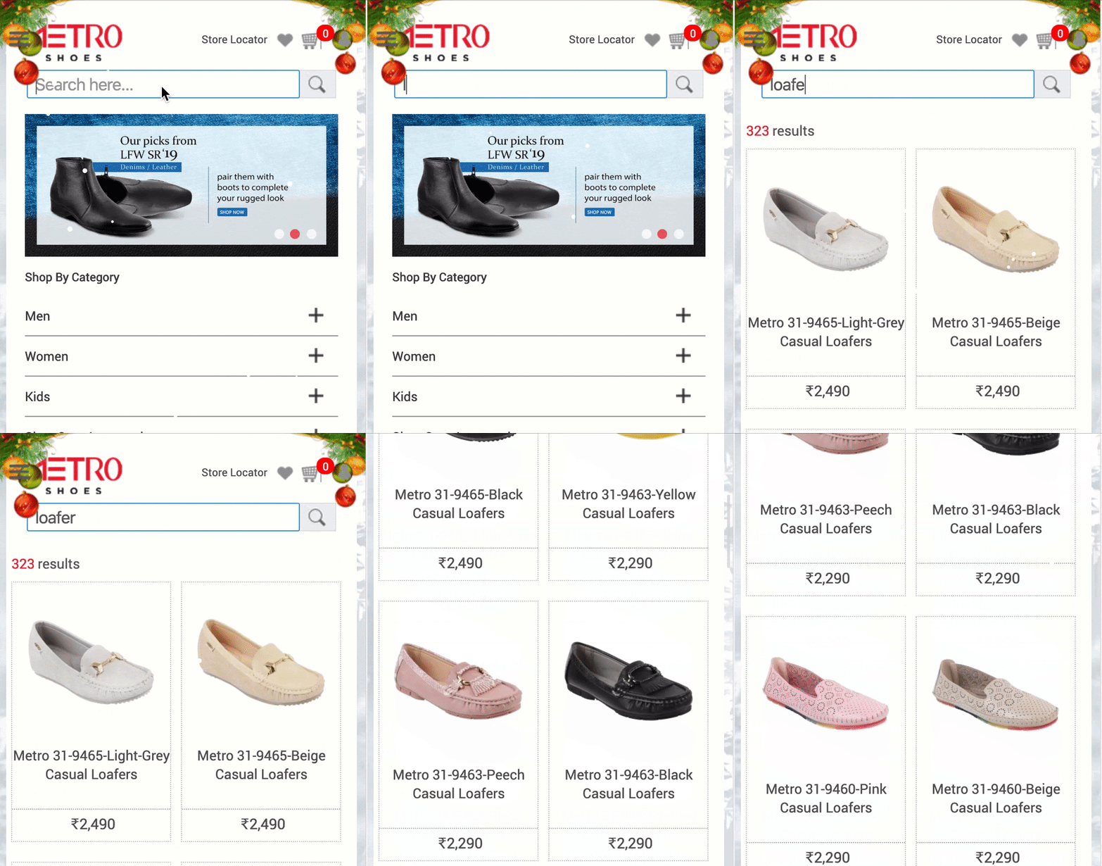
Speed is becoming a crucial factor for site search. With the increase in the speed of mobile internet networks and broadband lately, shoppers want sites to load faster and search results to appear immediately like they do with Google. Seeing this demand from the online retail stores, search technology introduced search-as-you-type technology. This advancement in search technology shows users relevant results right from the first keystroke.
This enabled visitors to discover more of your site with less typing and increased search speed which leads to higher conversion. This technology was supported by strong typo tolerance as well and it delivered search results directly instead of taking people to a “did you mean page”. While these seemed like small improvements in UX, they had a big impact on conversion and revenue.
Improve search page layout
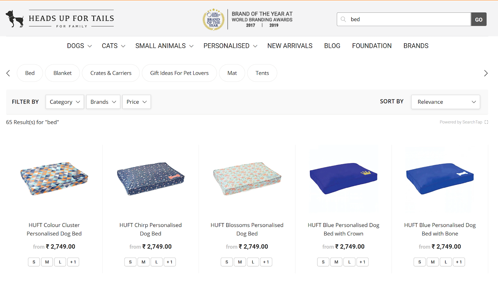
Having a competent e-commerce search is the first step but it is equally important to give visual feedback to search users. You could try to create a custom search page that keeps in line with your site’s visual design. Stores also make use of various call-to-actions like buy now, add to cart, or wishlist on the search results page itself so that customers can make a purchase easily if something catches their eye. Make sure that the buttons do not overlap or obscure any information.
Another important tip is not to remove the search query when a visitor is seeing the results. This helps users to refine or edit their search with ease and doesn’t break their flow while they are navigating.
Make search simpler
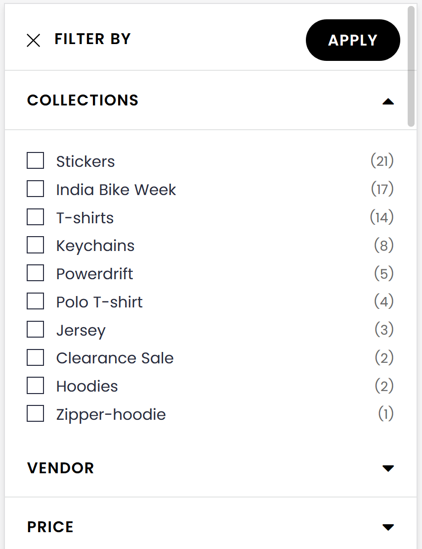
Many sites make use of filters on their search results page but often this complicates a visitor’s search journey thanks to irrelevant options that take them to dead ends. That is why stores have started to use smart dynamic filters which automatically remove irrelevant options to simplify this journey.
Another overlooked part of this process is creating relevant tags and categories that make it easier for searching your store’s offerings. Make use of subcategories because these can show your customers the range of your offerings and how to best navigate your store to find what they are looking for. Always make sure that you display the number of results available for the options otherwise customers might end up on a no results page and exit.
Showcase product information
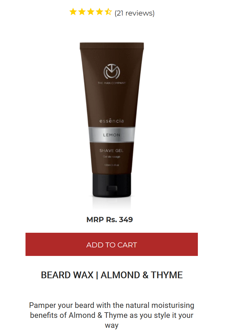
When it comes to optimizing the search results page, it's important to not only use detailed product images but present relevant information about them to give shoppers a complete picture. If shoppers have access to more information than just the price, they are more inclined to click-through to a product. Different stores can list information that seems pertinent to their offerings like electronic accessory stores can list compatibility, warranty, Bluetooth or wired while an apparel store can show various sizes available and alternate colours among others.
Customers consider information like price, description, ratings, etc when making a search. Including this information from the start gives users access to the product without them having to click through and keeps users engaged for longer.
Conclusions
You can use all this information to create a better layout for your search page. E-commerce websites are recommended to use grid-based view more than the list view. It’s more aesthetically appealing for use by shoppers as it allows them to carefully consider the product before clicking through.
Optimizing search can be very rewarding for an e-commerce site. Many existing search tools can deliver on these fronts but they will take time and expertise to work as intended. This is a big reason why many e-commerce stores are shifting to third-party solutions like SearchTap. Our team of search experts has helped many retailers revamp their search experiences and improve conversions. Let us know how we can help you by following this link .
SearchTap.io has helped many e-commerce stores improve their site search but also increase search conversions by 30-40%. You can learn more by booking a personalized demo with us or emailing us at hello@searchtap.io.



Hi there! Want to ask about something? Leave a message.